
5 POD Design Mistakes Beginners Make (And How to Fix Them)
Avoid common POD design mistakes and learn how Tapstitch ensures high-quality apparel printing with Brother and Kornit machines that bring your designs to life.
Designing a T-shirt is pretty simple, but it’s not totally foolproof. If you're new to POD apparel, there are a few design mistakes that can make your shirt show up looking... not quite like you pictured.
At Tapstitch, we've helped countless creators turn “just testing it out” into a full on clothing brand. We've seen what works, what doesn’t, and where things can go wrong.
So before you hit print, let’s run through five of the most common mistakes we encounter so that your design shows up looking how you wanted.
1. Using Low-Resolution Images

One of the most common print on demand mistakes is using low-resolution images that can’t hold up in print. An image that looks sharp on your screen can still print with visible pixels and poor detail if the resolution is too low.
The Problem:
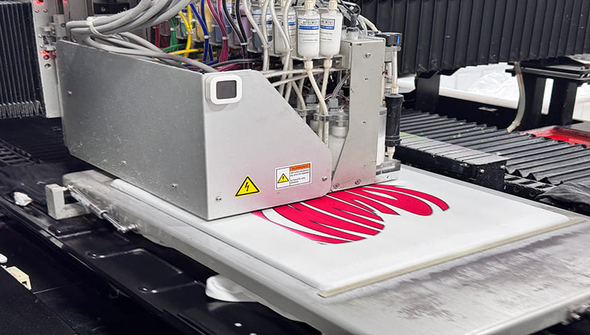
Even with high-end machines like our Brother GTX and Kornit Atlas, low-resolution files lead to low-quality prints. These printers are highly accurate, but they can't make up for detail that isn't there. If your design doesn't have the resolution to support scaling up, the print can come out looking blurry.
The Fix:
- Always upload artwork at 300 DPI
- Use high-res PNGs, PSDs, or vector files (like AI or SVG)
- Avoid overly compressed JPEGs or screenshots
Need help? Our team reviews every file before printing and flags potential issues for you.
Say goodbye to blurry prints. Try Tapstitch for studio-quality results.
2. Ignoring the Garment Color

Not every design works on every shirt, and fabric color plays a big role in how your POD apparel tuns out. An image that looks clean on a white tee might disappear or be hard to make out on a navy hoodie or black blank.
The Problem:
Ink behaves differently depending on the color of the fabric. On darker garments, light inks can get absorbed or dulled unless they're backed with a white underbase. Without a strong contrast between your design and the garment, even great artwork can disappear into the fabric.
The Fix:
We automatically apply a white underbase when needed, and you can preview how your design looks on different garment colors using our mockup tools. Just remember:
- Use bold contrasts
- Add outlines to light text on dark fabrics
- Always review mockups before approving
3. Text That's Too Small or Hard to Read

Not every font is made for fabric. If your text is too small, too thin, or overly decorative, it might not show up clearly once printed.
The Problem:
- Script or handwritten fonts bleed on fabric
- Thin lines disappear or blur
- Light text fades into the background
The Fix:
- Use at least 12pt text size
- Use bold fonts like Bebas Neue or Impact
- Ensure strong contrast between text and background
The goal of your POD design is to make a statement, not to make people squint.
4. Exceeding Print Area Limits
Every garment has print limitations. If your design goes beyond the safe area or is placed incorrectly, the result may look off-center—or worse, get cut off.
For example, a standard T-shirt offers:
- Front: Up to 30 × 40 cm
- Back: Up to 32 × 45 cm
- Sleeves and hems require special setups
How to avoid placement issues:
- Use Tapstitch-provided templates
- Leave at least 1 cm margin inside the print area
- Tapstitch offers an extremely wide range of printing designs.
5. Choosing the Wrong POD Provider

Not all POD services deliver the same quality. Some rely on cheap heat-transfer methods or low-grade inks, which often lead to faded prints, cracked designs, and disappointment.
Here’s why creators choose Tapstitch:
Why Tapstitch excels:
- Industrial-level machines: Brother GTX pro for high-detail jobs, Kornit POLY Pro for sustainable mass printing
- Advanced white ink layering for dark garments
- Human + AI-powered file review for every order
Don’t settle for cracking prints—Tapstitch delivers quality that lasts.
You Design. We Print.
Your design deserves the best. Even if it’s your first time creating POD clothing, Tapstitch brings years of experience to every order. From detailed file pre-checks to realistic mockups and top-tier print tech, we make sure your apparel looks just as good in print as it did in your head.
FAQ
1. What kind of design files are best for printing?
We recommend 300 DPI PNG, PSD, AI, or SVG files. Avoid low-res JPEGs, screenshots, or images pulled from social media.
2. What printing machines does Tapstitch use?
We use Brother GTX and Kornit POLY Pro printers, both known for exceptional color accuracy and industrial-grade durability.
3. Will the print fade after washing?
Not with Tapstitch. Our prints maintain color and clarity for over 50 washes thanks to our ink tech and curing process.
4. Can I get help reviewing my design?
Absolutely. Every file is reviewed before production, and we’ll reach out if anything needs adjusting to ensure top quality.


